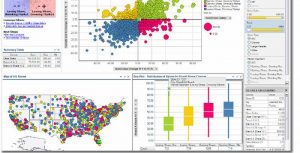
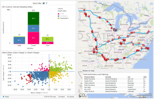
As we all know, a picture worth a thousand words. This is all the more true when working with large and heterogeneous amounts of data: it is a lot easier to spot outliers, trends, correlations if you can take a look at a visualization than to dive into a spreadsheet of numbers. Visualisations can make great use of what humans have evolved to: by using colors and shapes you can easily differentiate between important and negligible subjects. Exceptions are very easy to spot if they are shown as columns, whereas trends or deviation from trends show up immediately on a line chart.
Spotfire together with the expertise of our experienced analysts can make your every day work a lot easier by designing dasboards that fit your business processes the best. Spotfire can help you access every major type of datasource, integrate the data contained in them and prepare ready to use reports. Leveraging its APIs and web service add-ons, you can easily automate the most sophisticated tasks and create real-time, informative and responsive web pages.


